Block Library
Define reusable MDX blocks and insert them from the editor's slash command menu.
The Block Library lets you define reusable MDX components and make them available to editors directly from the slash command menu. Each block describes a component name, the props editors should fill in, and any imports or static attributes that should accompany every insertion.
Blocks are stored as a JSON file in your repository alongside your content, so the library travels with your project.
Opening the Block Library
In the dashboard sidebar, under Libraries, click Block Library. The page lists all blocks defined for the current project, with a search field to filter by name, description, or keyword.
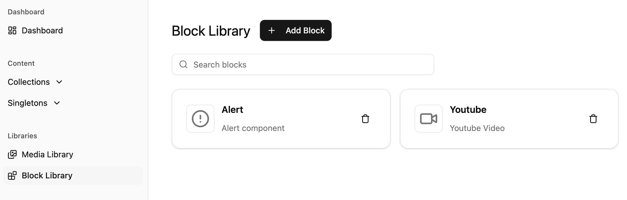
Only users with the collection management permission can add, edit, or delete blocks. Other users can still see the library and use the blocks from the editor.
Adding a block
Click Add Block to open the block wizard. Adding a block is a 3-step process.
Step 1 — Basics
Define how the block appears in the slash command menu and which imports it needs.
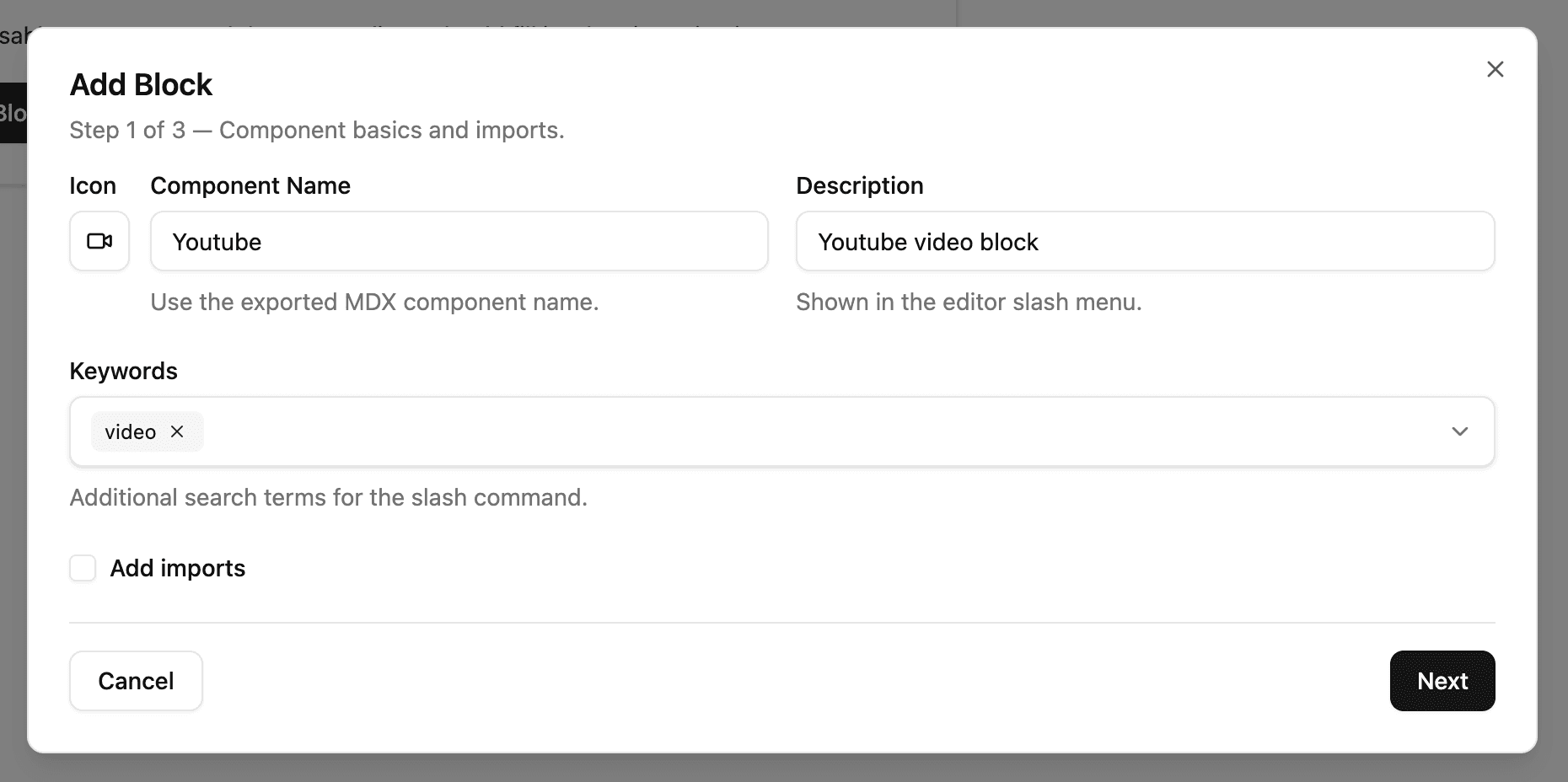
- Icon — Pick an icon from the Lucide catalog. The icon shows next to the block in the slash menu and on the block card in the editor.
- Component Name — The exact name of the exported MDX component. Must be PascalCase (e.g.
Callout,YouTubeEmbed). - Description — A short summary shown in the slash command menu.
- Keywords — Extra search terms so editors can find the block by purpose (e.g.
tip,warning,embed). - Add imports — Optional. When enabled, the imports field is added once at the top of any document that uses the block. Use this for
importstatements your component needs.
Step 2 — Props
Describe the props editors fill in when inserting the block. For each prop you can configure:
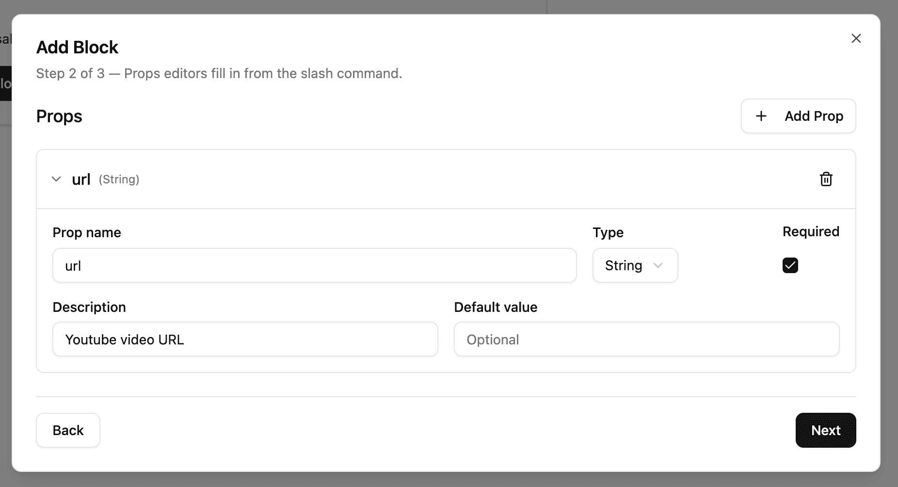
- Prop name — camelCase identifier used as the JSX attribute name.
- Type — One of:
String— single-line text, rendered asprop="value".Text— multi-line text, rendered asprop={"value"}to preserve newlines and quotes.Number— numeric value, rendered asprop={123}.Boolean— checkbox, rendered as the bare attribute whentrue, omitted whenfalse.Image— opens the Media Library so the editor can pick a file.Select— dropdown limited to the options you define.Date— date input.Children— multi-line text inserted between the opening and closing tags. A block can have at most oneChildrenprop.
- Required — Marks the prop as required in the editor UI. Required props are validated when the document is saved.
- Description — Helper text shown next to the field in the insert form.
- Default value — Pre-fills the prop when the block is inserted.
- Options — For
Selectprops only. Add at least one option per Select prop.
Each prop is collapsible so you can keep the editor compact while you work through a longer list. Prop names must be unique within a block.
Step 3 — Additional attributes
Optional. Add a string of JSX attributes that should be appended verbatim to every insertion of this block, after any prop attributes.
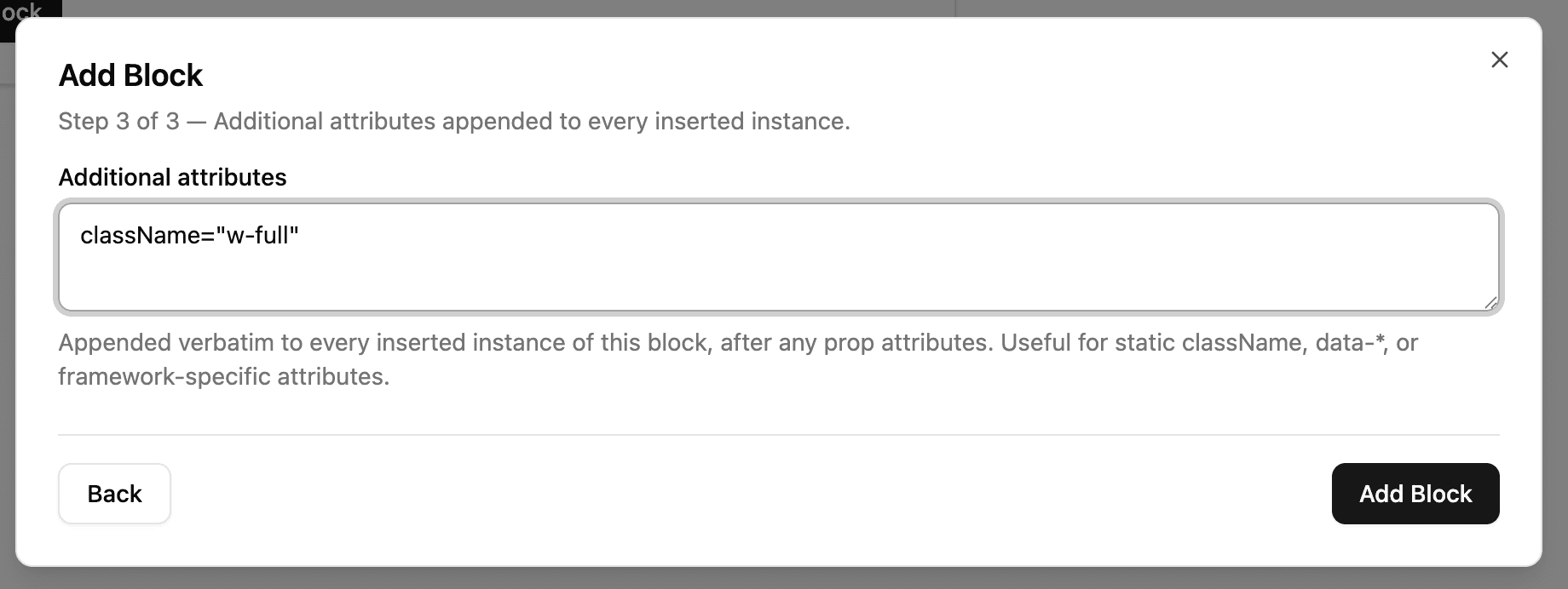
Use this for static attributes that never change between insertions, such as:
className="my-callout" data-variant="info"This is helpful for framework-specific attributes or for forcing every inserted block to ship with a consistent set of classes.
Editing and deleting a block
Click the block name on a card to open the wizard again and edit the block. Use the trash icon to delete it.
Renaming a block updates the library entry. Documents that already use the previous name are not rewritten — they continue to render the original JSX until you edit them.
Inserting a block from the editor
In the content editor, type / to open the slash command menu. Your custom blocks appear below the built-in commands. Filter by typing the block name, a keyword, or part of the description.

When you pick a block, Outstatic inserts an editable card with one input per prop. Required props show a red asterisk and are validated as you type.
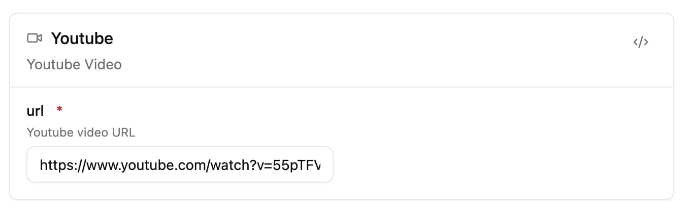
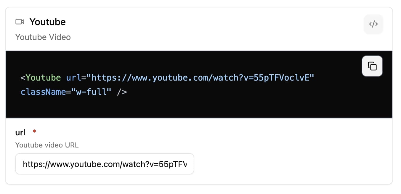
The card serializes to JSX in your saved document. You can click the <> icon on the card to preview the JSX that will be written to disk, and copy it to your clipboard with the copy button.
If a block was inserted before its definition w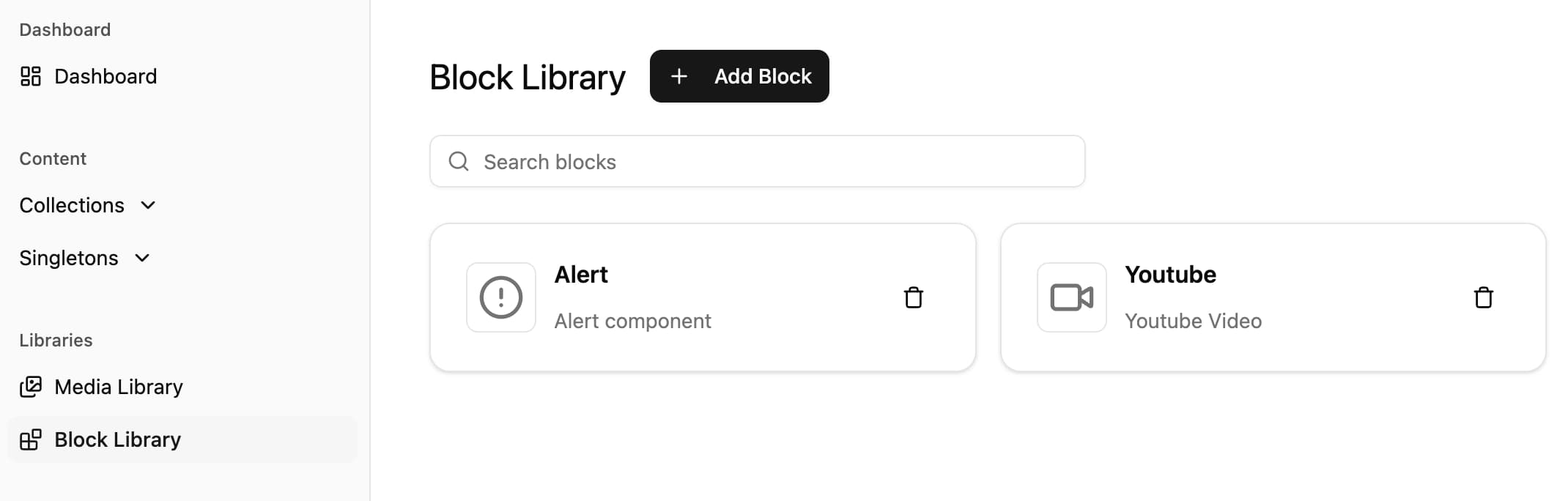
 as edited, the existing instance keeps the original JSX and continues to work as a regular MDX block.
How blocks are stored
Block definitions live in a JSON file inside your content folder. The dashboard commits changes to this file through GitHub like any other content update, so block changes are versioned along with the rest of your project.
When a document uses a block, the saved markdown includes:
- The block's
imports(only once, at the top of the document, below the frontmatter). - The serialized JSX for each insertion, including any Additional attributes.
Rendering blocks on your site
Outstatic only handles authoring and storage. To render the blocks on your site, point your MDX pipeline at the saved document and make the matching React components available — typically via the imports your block definition writes.
For a Next.js site that usually means using mdx-bundler, next-mdx-remote, or @mdx-js/mdx. See the MDX block page for the rendering details, since custom blocks are saved as the same kind of MDX source.
Permissions
- View Block Library and insert blocks — any signed-in user.
- Add, edit, or delete blocks — users with the
collections.managepermission. See Roles & Permissions for details.